CP Creative Studio Page Layout Services Include:
Brochures
Advertisements
Magazines
Business Cards
Page Layout For Print And Digital Formats
Page layout is a term used to describe the process of arranging text and imagery in a document. Whether they’re created for a business card or a several-hundred-page book, they need to be organized in a manner that is reader-friendly and visually appealing. Reading is supposed to be fun and engaging. It’s not supposed to give you eye fatigue. I always implement the best practices for typography. That means I pay careful attention to how the elements on a page interact with each other in terms of color, horizontal and vertical space.
Brochures
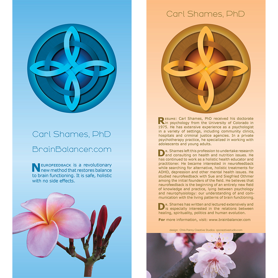
Having your brochure design look beautiful will make your company look all the more appealing. Think of them as a pocket-sized billboard that provide a wealth of information on your company’s products and services.
Advertisements and Promotional materials
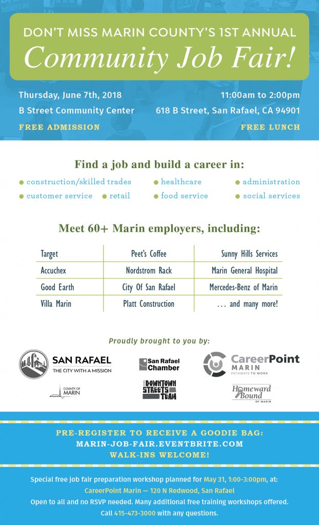
If you have an upcoming event, let me help you get the word out with a professional looking advertisement to entice your viewers. I’ll work side by side with you from start to finish. Your vision and input is crucial to building a message that resonates with you and your audience. We’ll pick the fonts that you want and layout the elements for the ad to your specification. I’ll use my design skills to make it look beautiful. The last phase will be for me to optimize it for the print shop or the digital format of your choice!
Magazines
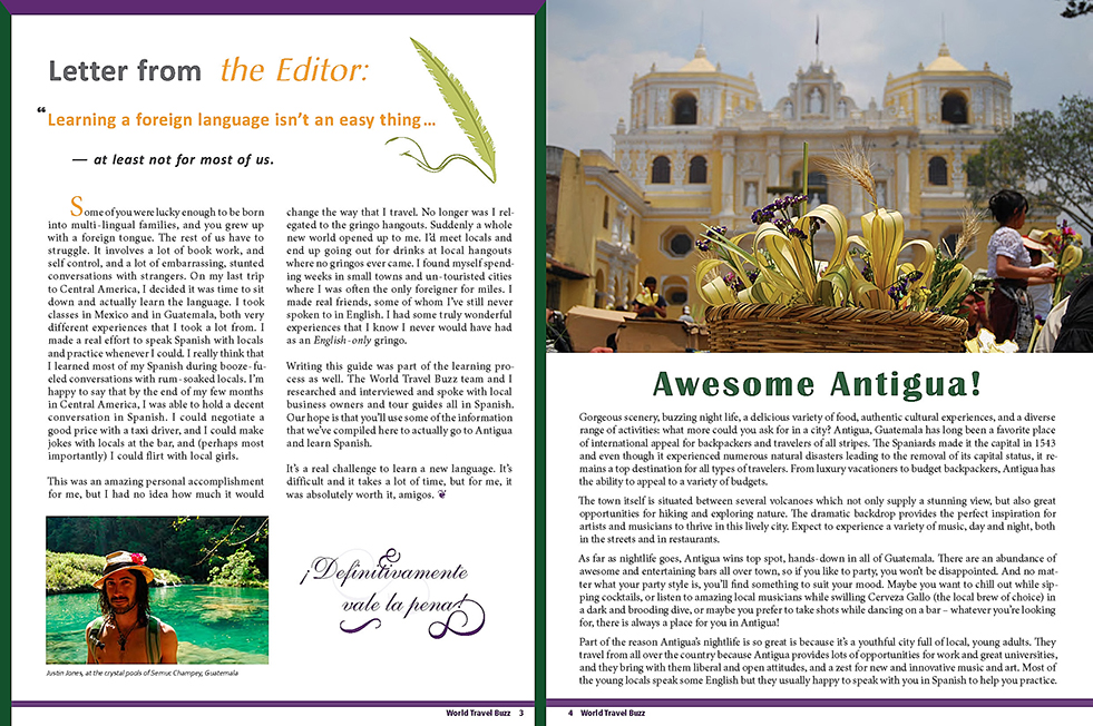
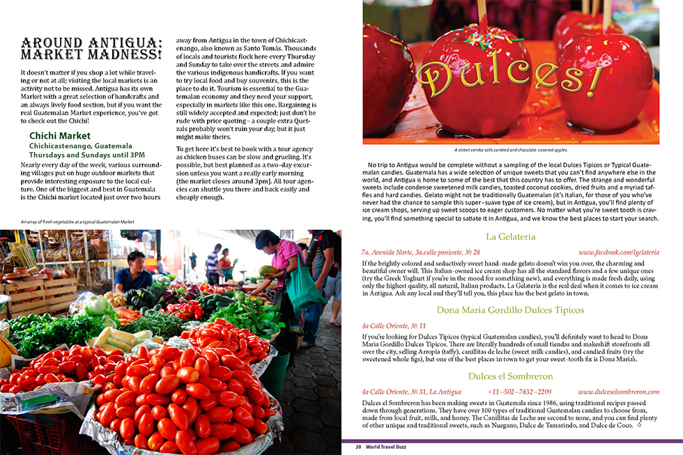
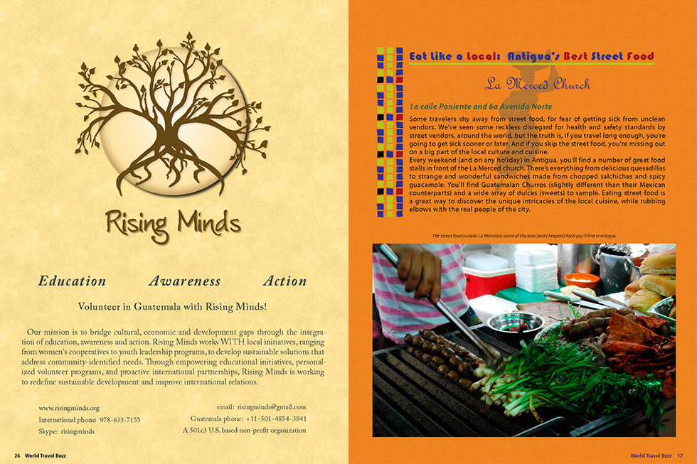
Laying out the elements for a magazine require a talent for making the best use of space and a deep understanding of typography. It’s a lengthy process to assemble and the attention to detail cannot be overstated. I pay close attention to how the various elements interact with each other. Elements like imagery, type, color, vertical and horizontal space all play a role in making a harmonious layout.
Samples from travel magazine
Business Cards
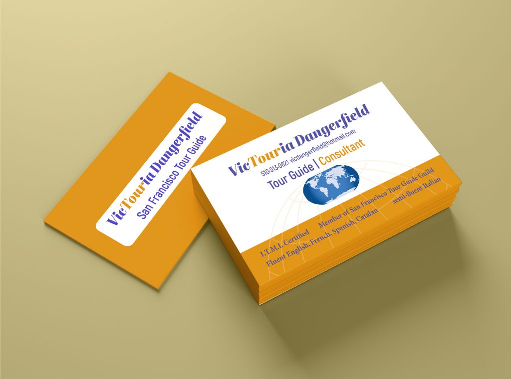
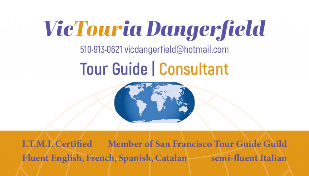
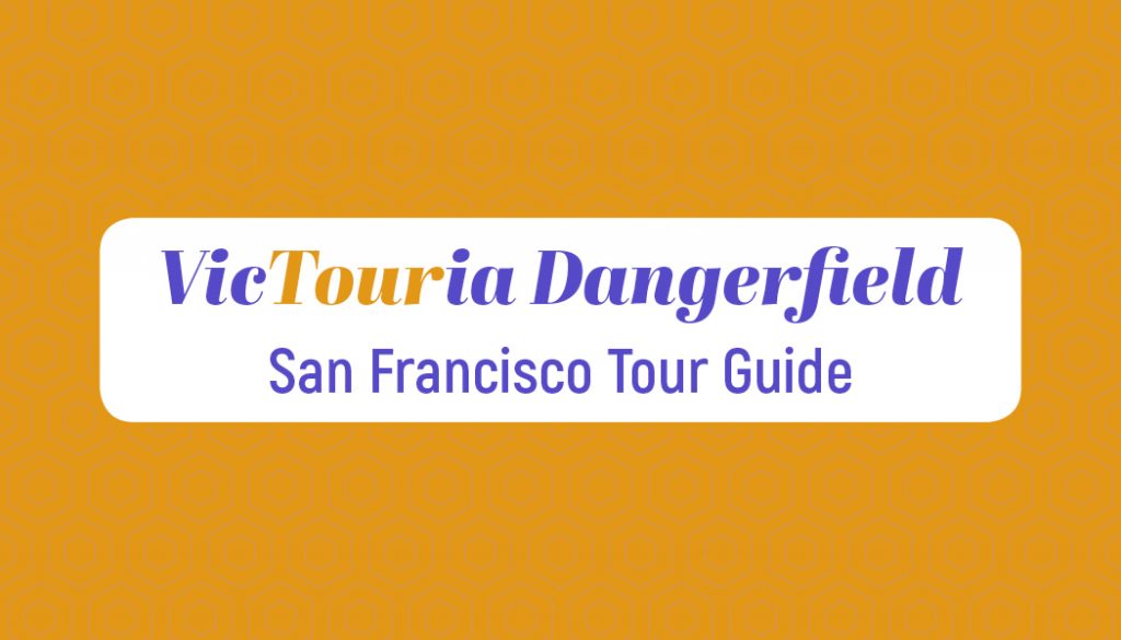
business card samples
The fastest way to introduce your company to another colleague is through a business card. Likewise, the fastest way to turn someone off to your company is through a poorly designed card. They’ll simply think you don’t care enough about your appearance and the first impression you make. A beautiful looking business card is often times the first step in getting respect and recognition for your products and services. It’s the stepping stone for building trust. No trust = no clients. When I design cards, I do research on my client’s message. I ask what colors appeal to them and what colors don’t. The same goes for choosing the right font. It’s a step-by-step process so I can create something that they can confidently pass along to perspective customers and build that solid relationship.

